Making 'Cliff Fall, Charmouth' 2026
Publication date: 30 March 2026
The making of 'Cliff Fall, Charmouth' in the Spring of 2026
I thought it might be helpful to illustrate how this print was made.
This post will probably be of most interest to people who are developing their linoprint skills and techniques, as it reveals development processes that are not immediately apparent when looking at the final print. But if you know all about lino printing, then these notes will probably have you pulling your hair out!
I also think it is valuable to communicate to anyone interested in printmaking in general what goes into making one of these limited edition artworks.
Each stage is shown here alongside the finished print, to save you having to scroll up and down to see what relates to what. There's a larger image of the print at the end of this narrative.
Please note... this is 'my process', which is almost certainly flawed in all kinds of ways - others will go about print like this very differently (and probably a lot less laboriously!)
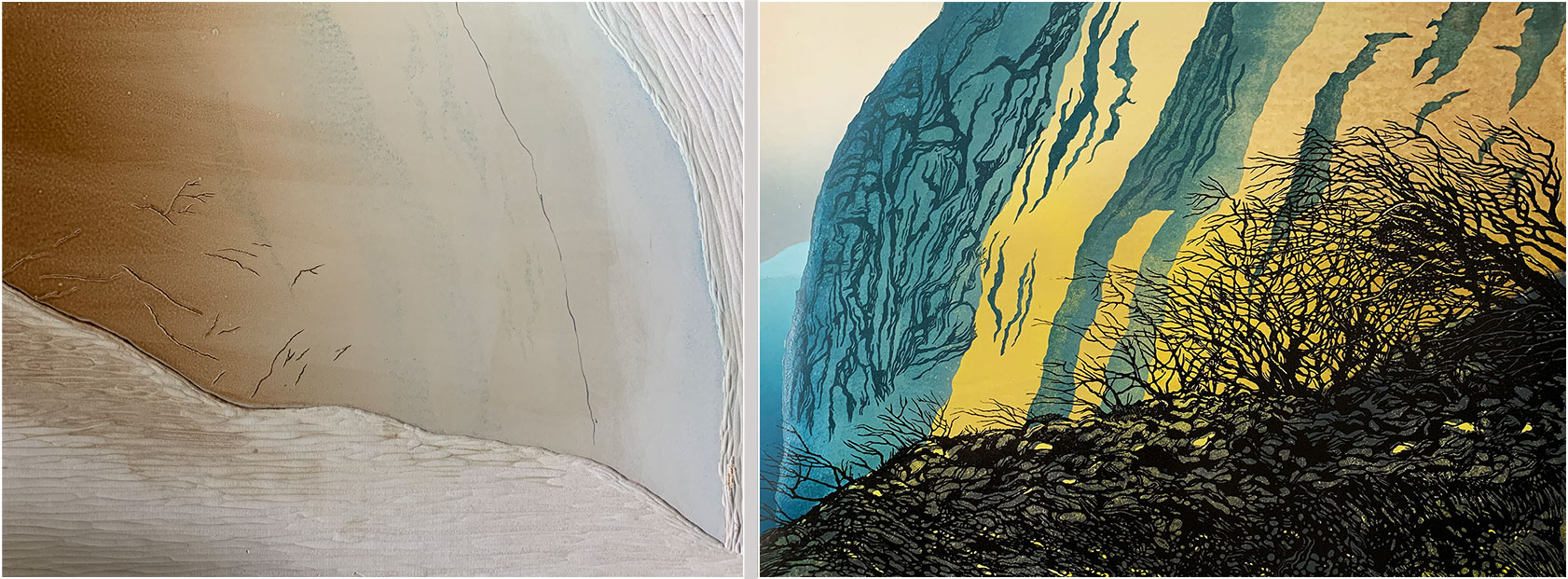
The story begins with a trip to Charmouth in West Dorset, here in the UK. Many people visit the beach, at the mouth of the River Char, to collect the fossils - ammonites, belemnites and suchlike - that lie on the sand waiting to be found. The beach is famous for them.
The area has also been in the news because of recent cliff falls that have added a bit of drama to the landscape. As you can see in my photo, large portions of cliff, along with the trees attached to it, have made their way down onto the sands.
This is the photo that inspired my print.
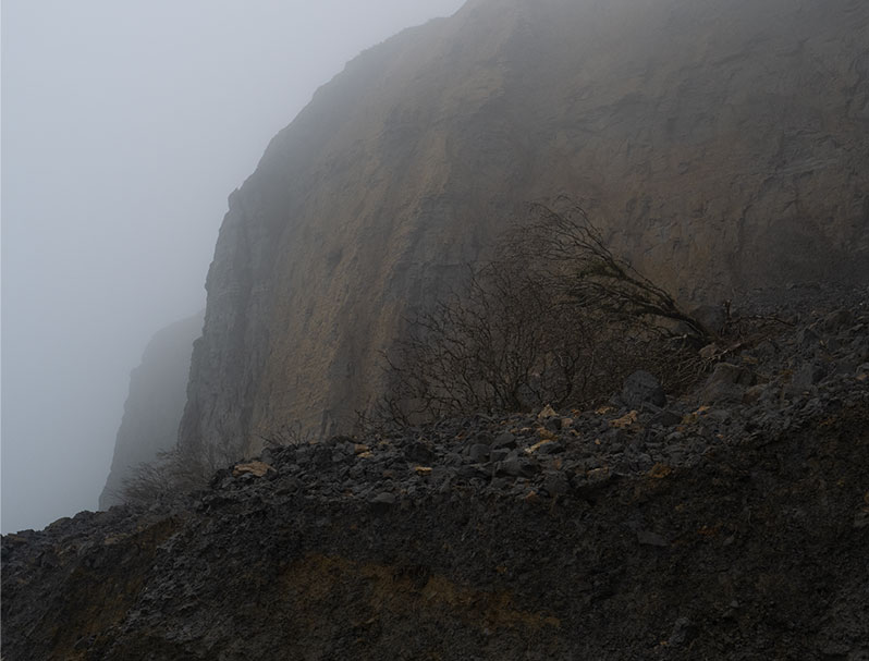
It wasn't the best weather to spend time on the beach drawing the scene (and I tend to take a lot of photographs of different views which I like to mull over at home before deciding which to progress with, so my camera is a bit of a necessity).
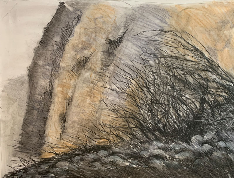
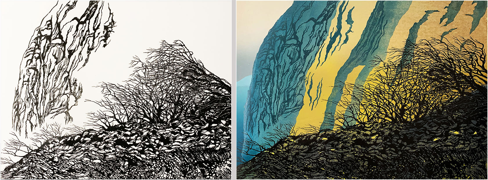
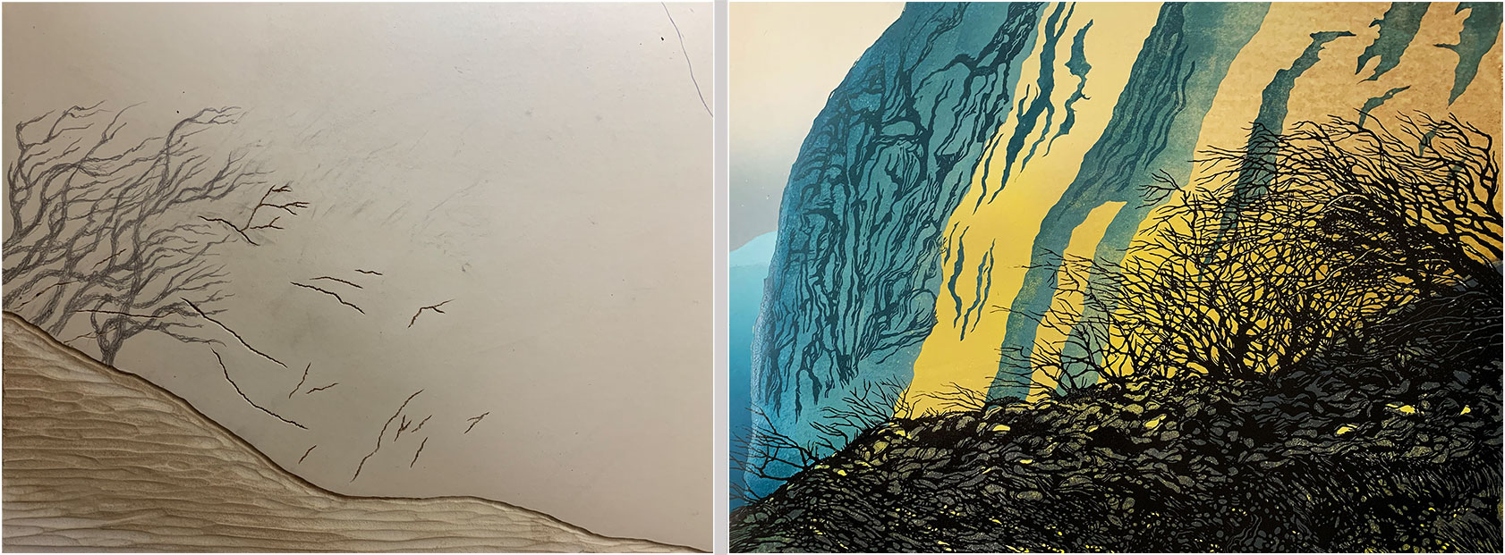
After selecting the image I wanted to work with, I produced this charcoal drawing from it.
My aim here is to draw quite quickly - I want loose, dynamic, strokes that will make it into the foreground of the print, plus some suggestion of the colour path I'll follow.
I also want to break away from the photograph, towards an image more imagined and hand-made.
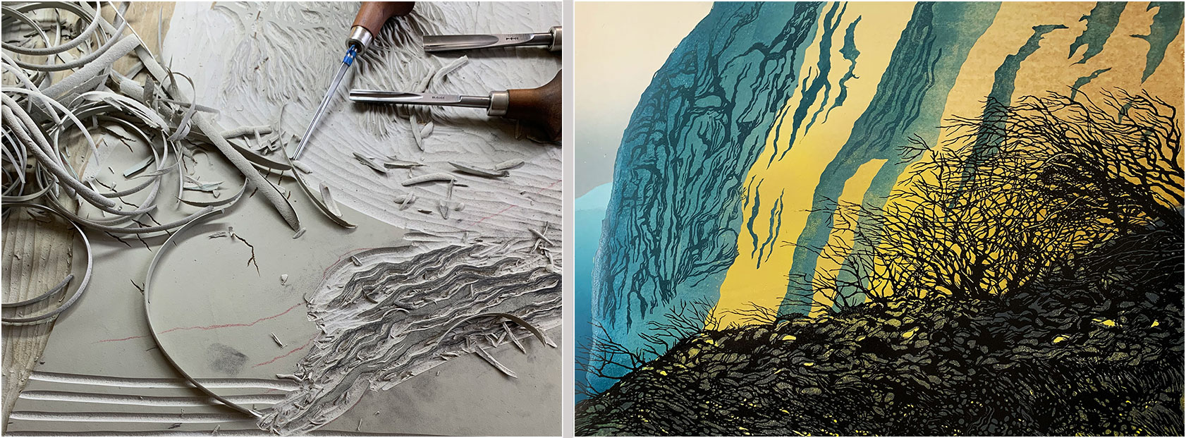
Although the background of the print (the bits that aren't printed with black ink) will be printed first, I cut the detailed foreground at this early stage because I need to know where certain parts of the foreground will sit - this is mainly to do with allowing some of the background yellow to colour some of the foreground-defined rocks and bloulders. I also want to try to get some white into the branches, so I need to know where to cut that away from the background block before I cover the paper with yellow ink (this plan failed because I didn't get the registration right. Sigh).
My cutting guide here is a freehand drawing done using charcoal (because I like the quality of drawn line it provides, and it's surprisingly resistant to scuffing during the cutting process). Although I'm referencing my original drawing, there are a lot of new shapes and linework here, especially in the ground below the trees.
Also worth noting is that the drawing on the lino is reversed, as compared with the original drawing... because... printmaking...
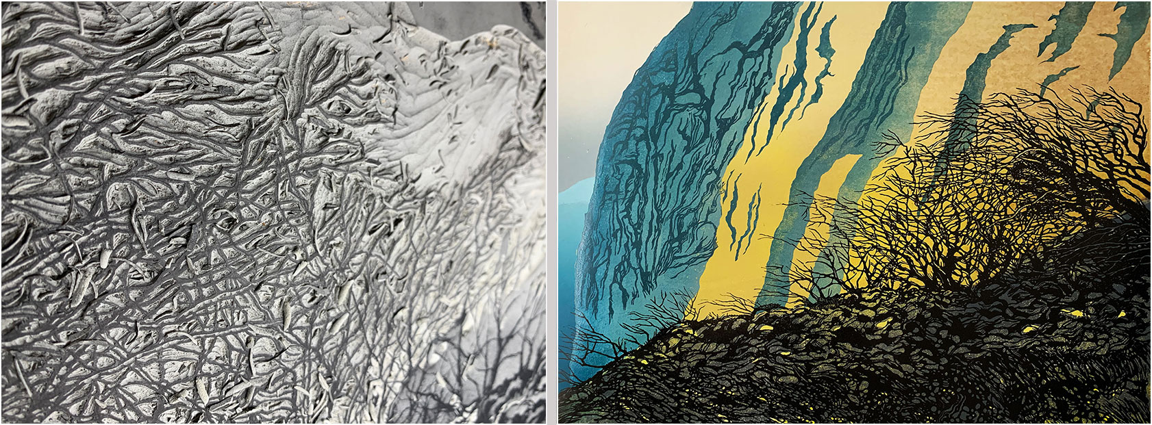
This is a detail of the tree cutting. I use Pfeil lino tools - for most of the detailed cutting in this print I used one of their smallest 'V' gouges.
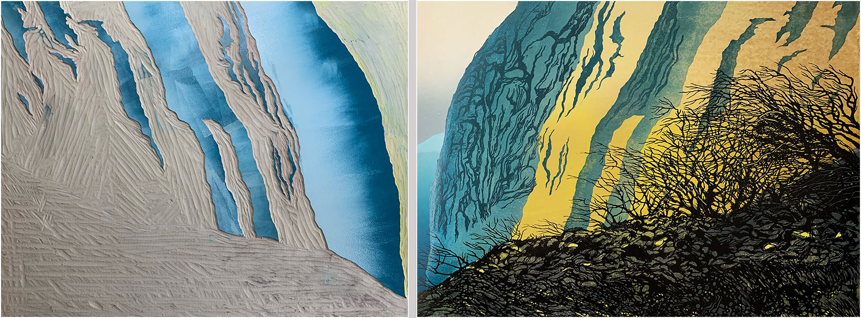
When the foreground cutting was finished, I printed this proof onto white paper to check the look of it. Note that some of the cliff detail is included on this block - the plan is to print the trees and ground in black and the cliff marks in blue/grey.
Not all the elements you can see here made it to the final print... adjustments were made along the way.
This image shows the lino block for the background. I've already printed the cream-coloured faded sky prior to any cutting taking place. I've now cut away the lino to preserve the sky elment and I'm about to print that little slither to the right, which will be the cliff face in the distance.
I work with hessian-backed, battleship grey lino (which is made from linseed oil, cork dust, and wood flour). I print onto Heritage Rag 300gsm paper with, in this case, water-washable, oil-based inks made by the Graphic Chemical company (this will be one of my last prints using ink from GC due to supply issues and other problems at the manufacturing end - which is a shame, because I'm very used to working with their ink).
The final print (image area) will be 50x40cm.
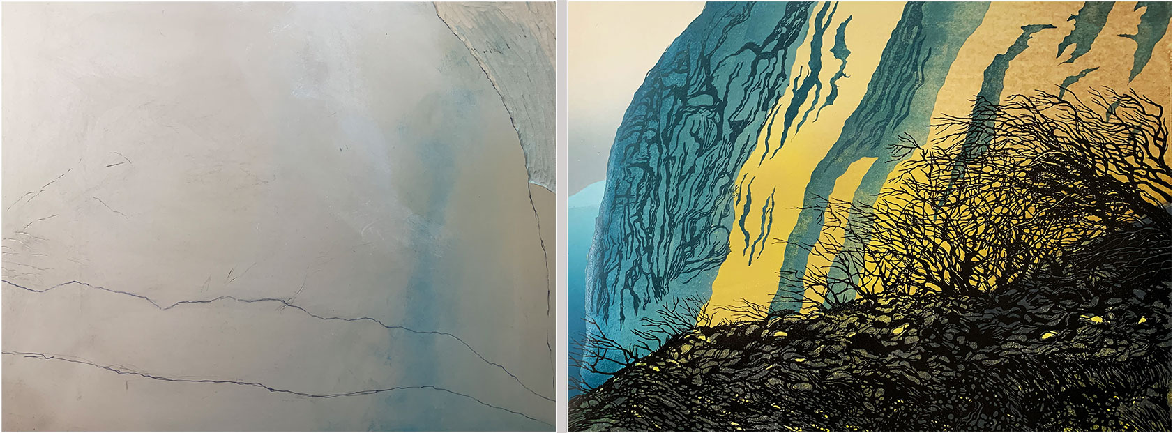
Here's the sky and distant cliff printed onto the paper.
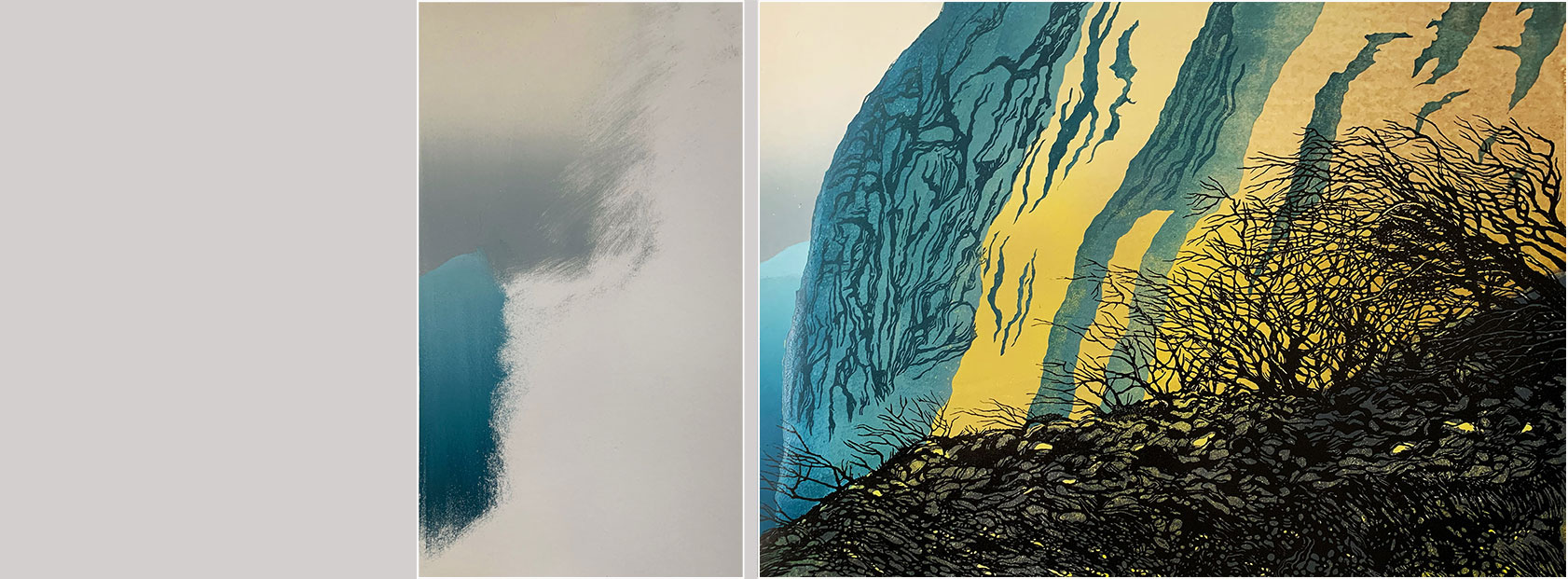
I wipe away some of the ink from the lino on the right-hand side so that when I print the next colour it doesn't show as a pronounced mark in the print.
I'm aiming for 10 prints in this (unrepeatable) edition, so I start with 15 (to allow for proofs and errors along the way).
While it is possible to print lino without a press, I prefer to do all the printing at a very light pressure setting on my Gunnings No.2 etching press, which makes the process a less strenuous one.
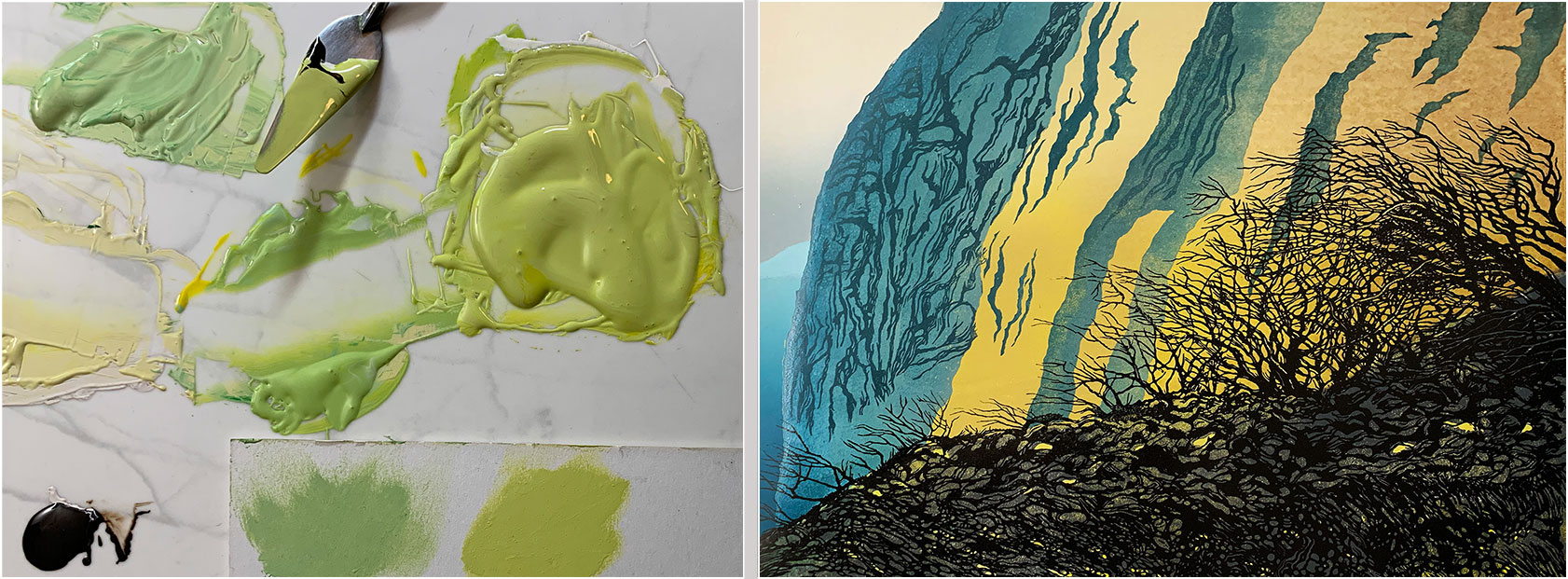
Mixing ink for the yellow - I smudge some onto the paper to see how it'll look after printing.
One problem here is choosing a colour that will not only work over a large area of the print, but will also work when the foreground is printed over it (from the second block). It's quite difficult to backtrack if the wrong choice is made, bearing in mind that the previous print of the sky and the distant cliff cannot be repeated, because the lino that was used to print those colours has now been cut away... so, all the time, I'm thinking about the small number of 'spare' prints that are available to compensate for things that might go wrong.
Why not simply print more to begin with? Well, apart from the cost of the paper and ink, and the time required to print each colour (I expect at least 20 minutes per colour per print - and often longer than that) the printing stage is tiring, messy and repetitive... which is great if you like that kind of thing...
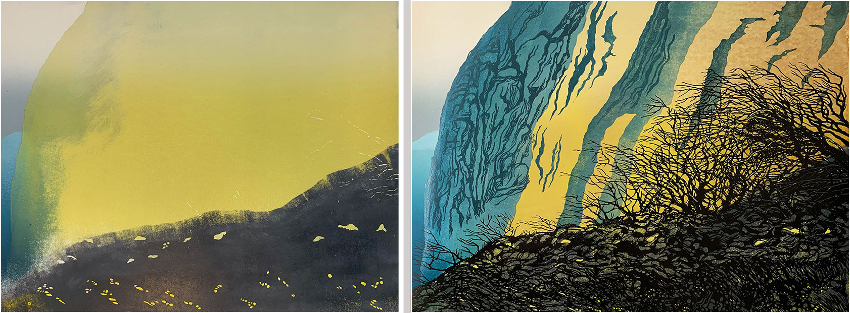
The yellow after printing. I was expecting those smudgy marks to the left (residue from the sky and distant cliff printing) and I'm planning to print more colour in that area to hide them.
I didn't want solid yellow behind all of the foreground, hence the white, unprinted, area. I was hoping for different densities of yellow to show through to selected parts of the foreground.

I need this grey to sit behind the foreground, but, as mentioned above, I also want some yellow to show through. To achieve this, I traced part of the foreground image (see 4, above), then I cut away the boulder/rock shapes that I want to show through as yellow. After that, I drew a line using indelible ink so I could see where the top edge of the grey had to sit, which enabled me to apply the ink using only a roller (rather than cutting away any of the lino). This had to be fairly precise so that the top edge of the grey would be hidden behind the subsequent printing of the foreground black.
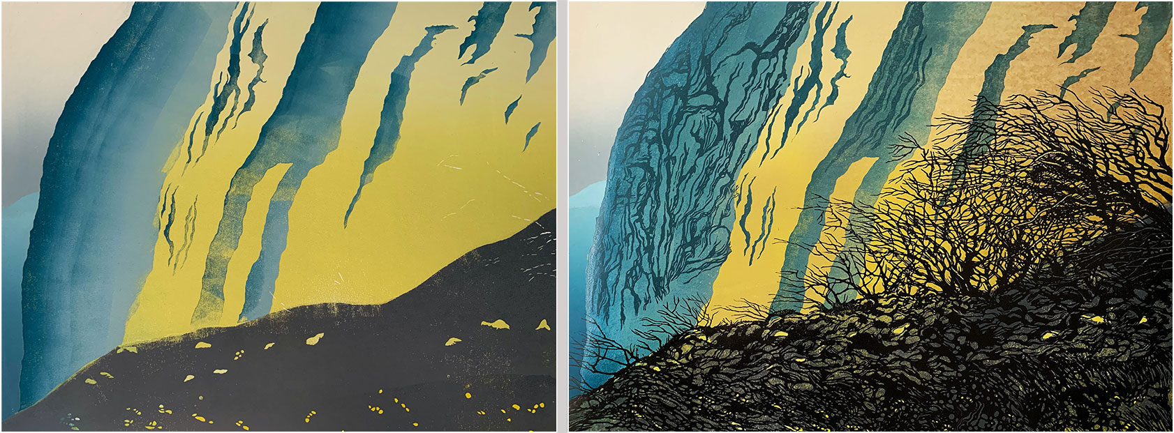
Next, the background block (that carried the yellow and grey, and the sky and distant cliff) is cut away, leaving only the sections shown here, which are inked in this photo and ready to print. Note that the inking is quite rough - I wanted to use the roller to create some additional cliff texture. I also had to estimate how the transparency of the blue would interact with the previously-printed yellow - I was expecting a blue/green, which is pretty much what I got.
The blue cliff colour after printing.
With the background printing finished, it's back to the foreground block. Here, it's inked with black for the trees and ground, and a darker blue for the cliff detail.
But there's a problem... the background looks too bright.
Fortunately, this was noted when I had only printed the foreground onto a single print.
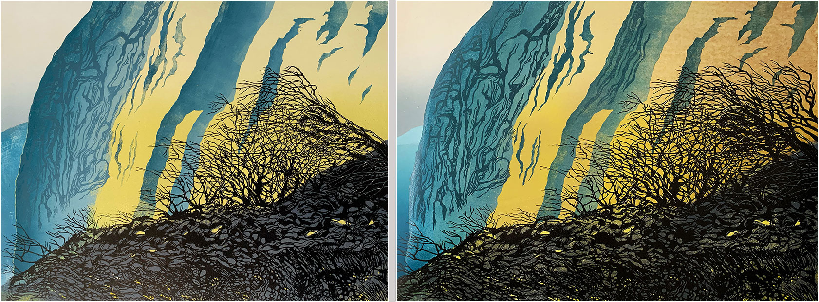
To deal with the brightness issue, I prepped a third piece of lino, cut away the ground section and the sky and the distant cliffs, and experimented with ochre-coloured ink mixed with a large amount of ink vehicle (this is the stuff used as the base for these inks - it's a bit like a matt varnish when printed on its own - different quantities of ochre make it... more ochery...
To see if it had a chance of working, I hand-painted some of this mixture onto the over-bright print before using my largest roller to apply the ink to the lino block with a fade/grade, so it was darker towards the edge of the print. At this stage it was difficult to be sure that the ochre wouldn't make the print too dark and/or obscure some or all of the work I'd put into the trees.
Here's how it looked after the ochre layer was applied. The mottling effect is due to the ink/vehicle mix - I was ok with that as it adds texture to the background (note how often unplanned stuff happens - the trick is to be in a position to make use of the unexpected or to back away from it, bearing in mind the small number of spare prints for when things go wrong... by this stage I think I'd used up four of them).
Before the ochre was applied and printed, I cut away some of the block to get some highlighting onto the branches, which worked.
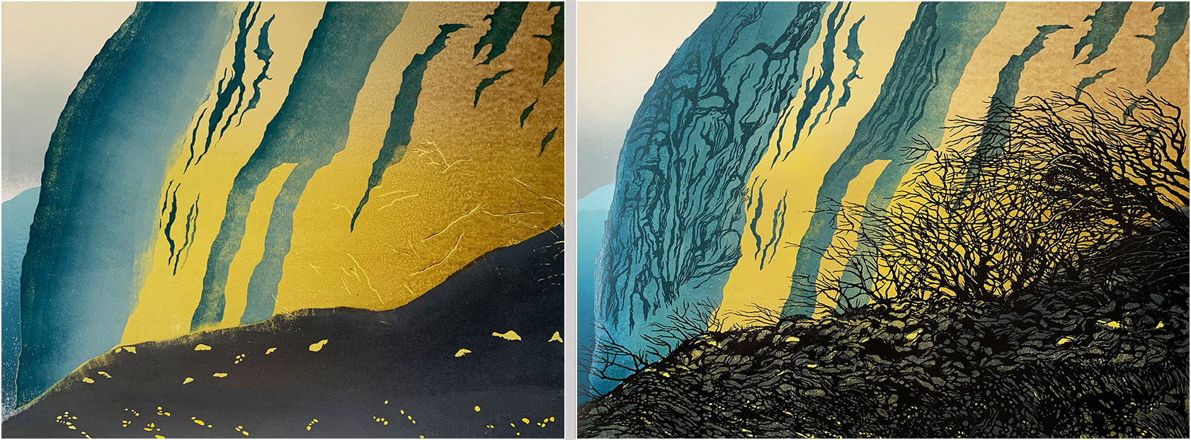
This picture shows most of the prints with the ochre - the print in the middle is still to be printed - you can see the difference in tone.
At this stage I had become less happy with the foreground image.
I felt there needed to be more tree action to the right of the previously-cut trees, and I wanted some more cliff detail in the centre of the print.
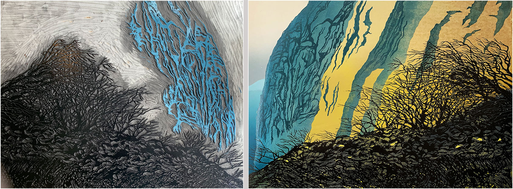
This photo shows the block that I used for the ochre overprint now being used for these additional (unplanned for) details within which, as we all know, the devil resides...
Here's a work-in-progress photo of that final block. All the trees and the cliff detail have been cut, and I'm clearing away the unwanted lino. Those big cuts at the bottom of the picture are a technique that makes it easier to clear away big areas of lino... the cuts you can see are fairly hard work, but they make the process of cutting the remaining strip a bit easier on the hand.
The eagle-eyed among you may notice that some of the new cliff marks here don't appear on the final print. That's because some of them overlapped the cliff marks from the foreground block and made a mess of it. They were cut away with the loss of one more of the 'spare' prints.
The making of 'Cliff Fall, Charmouth' in the Spring of 2026
I thought it might be helpful to illustrate how this print was made.
This post will probably be of most interest to people who are developing their linoprint skills and techniques, as it reveals development processes that are not immediately apparent when looking at the final print. But if you know all about lino printing, then these notes will probably have you pulling your hair out!
I also think it is valuable to communicate to anyone interested in printmaking in general what goes into making one of these limited edition artworks.
Each stage is shown here alongside the finished print, to save you having to scroll up and down to see what relates to what. There's a larger image of the print at the end of this narrative.
Please note... this is 'my process', which is almost certainly flawed in all kinds of ways - others will go about print like this very differently (and probably a lot less laboriously!)
The story begins with a trip to Charmouth in West Dorset, here in the UK. Many people visit the beach, at the mouth of the River Char, to collect the fossils - ammonites, belemnites and suchlike - that lie on the sand waiting to be found. The beach is famous for them.
The area has also been in the news because of recent cliff falls that have added a bit of drama to the landscape. As you can see in my photo, large portions of cliff, along with the trees attached to it, have made their way down onto the sands.
This is the photo that inspired my print.
It wasn't the best weather to spend time on the beach drawing the scene (and I tend to take a lot of photographs of different views which I like to mull over at home before deciding which to progress with, so my camera is a bit of a necessity).
After selecting the image I wanted to work with, I produced this charcoal drawing from it.
My aim here is to draw quite quickly - I want loose, dynamic, strokes that will make it into the foreground of the print, plus some suggestion of the colour path I'll follow.
I also want to break away from the photograph, towards an image more imagined and hand-made.
Although the background of the print (the bits that aren't printed with black ink) will be printed first, I cut the detailed foreground at this early stage because I need to know where certain parts of the foreground will sit - this is mainly to do with allowing some of the background yellow to colour some of the foreground-defined rocks and bloulders. I also want to try to get some white into the branches, so I need to know where to cut that away from the background block before I cover the paper with yellow ink (this plan failed because I didn't get the registration right. Sigh).
My cutting guide here is a freehand drawing done using charcoal (because I like the quality of drawn line it provides, and it's surprisingly resistant to scuffing during the cutting process). Although I'm referencing my original drawing, there are a lot of new shapes and linework here, especially in the ground below the trees.
Also worth noting is that the drawing on the lino is reversed, as compared with the original drawing... because... printmaking...
This is a detail of the tree cutting. I use Pfeil lino tools - for most of the detailed cutting in this print I used one of their smallest 'V' gouges.
When the foreground cutting was finished, I printed this proof onto white paper to check the look of it. Note that some of the cliff detail is included on this block - the plan is to print the trees and ground in black and the cliff marks in blue/grey.
Not all the elements you can see here made it to the final print... adjustments were made along the way.
This image shows the lino block for the background. I've already printed the cream-coloured faded sky prior to any cutting taking place. I've now cut away the lino to preserve the sky elment and I'm about to print that little slither to the right, which will be the cliff face in the distance.
I work with hessian-backed, battleship grey lino (which is made from linseed oil, cork dust, and wood flour). I print onto Heritage Rag 300gsm paper with, in this case, water-washable, oil-based inks made by the Graphic Chemical company (this will be one of my last prints using ink from GC due to supply issues and other problems at the manufacturing end - which is a shame, because I'm very used to working with their ink).
The final print (image area) will be 50x40cm.
Here's the sky and distant cliff printed onto the paper.
I wipe away some of the ink from the lino on the right-hand side so that when I print the next colour it doesn't show as a pronounced mark in the print.
I'm aiming for 10 prints in this (unrepeatable) edition, so I start with 15 (to allow for proofs and errors along the way).
While it is possible to print lino without a press, I prefer to do all the printing at a very light pressure setting on my Gunnings No.2 etching press, which makes the process a less strenuous one.
Mixing ink for the yellow - I smudge some onto the paper to see how it'll look after printing.
One problem here is choosing a colour that will not only work over a large area of the print, but will also work when the foreground is printed over it (from the second block). It's quite difficult to backtrack if the wrong choice is made, bearing in mind that the previous print of the sky and the distant cliff cannot be repeated, because the lino that was used to print those colours has now been cut away... so, all the time, I'm thinking about the small number of 'spare' prints that are available to compensate for things that might go wrong.
Why not simply print more to begin with? Well, apart from the cost of the paper and ink, and the time required to print each colour (I expect at least 20 minutes per colour per print - and often longer than that) the printing stage is tiring, messy and repetitive... which is great if you like that kind of thing...
The yellow after printing. I was expecting those smudgy marks to the left (residue from the sky and distant cliff printing) and I'm planning to print more colour in that area to hide them.
I didn't want solid yellow behind all of the foreground, hence the white, unprinted, area. I was hoping for different densities of yellow to show through to selected parts of the foreground.
I need this grey to sit behind the foreground, but, as mentioned above, I also want some yellow to show through. To achieve this, I traced part of the foreground image (see 4, above), then I cut away the boulder/rock shapes that I want to show through as yellow. After that, I drew a line using indelible ink so I could see where the top edge of the grey had to sit, which enabled me to apply the ink using only a roller (rather than cutting away any of the lino). This had to be fairly precise so that the top edge of the grey would be hidden behind the subsequent printing of the foreground black.
Next, the background block (that carried the yellow and grey, and the sky and distant cliff) is cut away, leaving only the sections shown here, which are inked in this photo and ready to print. Note that the inking is quite rough - I wanted to use the roller to create some additional cliff texture. I also had to estimate how the transparency of the blue would interact with the previously-printed yellow - I was expecting a blue/green, which is pretty much what I got.
The blue cliff colour after printing.
With the background printing finished, it's back to the foreground block. Here, it's inked with black for the trees and ground, and a darker blue for the cliff detail.
But there's a problem... the background looks too bright.
Fortunately, this was noted when I had only printed the foreground onto a single print.
To deal with the brightness issue, I prepped a third piece of lino, cut away the ground section and the sky and the distant cliffs, and experimented with ochre-coloured ink mixed with a large amount of ink vehicle (this is the stuff used as the base for these inks - it's a bit like a matt varnish when printed on its own - different quantities of ochre make it... more ochery...
To see if it had a chance of working, I hand-painted some of this mixture onto the over-bright print before using my largest roller to apply the ink to the lino block with a fade/grade, so it was darker towards the edge of the print. At this stage it was difficult to be sure that the ochre wouldn't make the print too dark and/or obscure some or all of the work I'd put into the trees.
Here's how it looked after the ochre layer was applied. The mottling effect is due to the ink/vehicle mix - I was ok with that as it adds texture to the background (note how often unplanned stuff happens - the trick is to be in a position to make use of the unexpected or to back away from it, bearing in mind the small number of spare prints for when things go wrong... by this stage I think I'd used up four of them).
Before the ochre was applied and printed, I cut away some of the block to get some highlighting onto the branches, which worked.
This picture shows most of the prints with the ochre - the print in the middle is still to be printed - you can see the difference in tone.
At this stage I had become less happy with the foreground image.
I felt there needed to be more tree action to the right of the previously-cut trees, and I wanted some more cliff detail in the centre of the print.
This photo shows the block that I used for the ochre overprint now being used for these additional (unplanned for) details within which, as we all know, the devil resides...
Here's a work-in-progress photo of that final block. All the trees and the cliff detail have been cut, and I'm clearing away the unwanted lino. Those big cuts at the bottom of the picture are a technique that makes it easier to clear away big areas of lino... the cuts you can see are fairly hard work, but they make the process of cutting the remaining strip a bit easier on the hand.
The eagle-eyed among you may notice that some of the new cliff marks here don't appear on the final print. That's because some of them overlapped the cliff marks from the foreground block and made a mess of it. They were cut away with the loss of one more of the 'spare' prints.
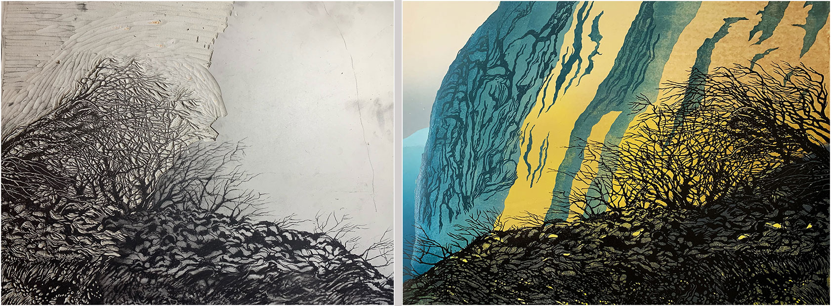
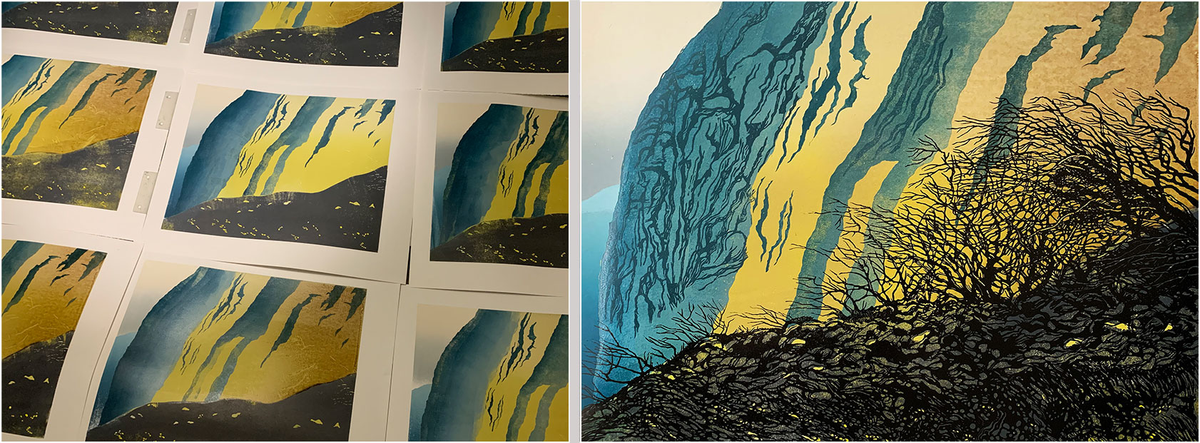
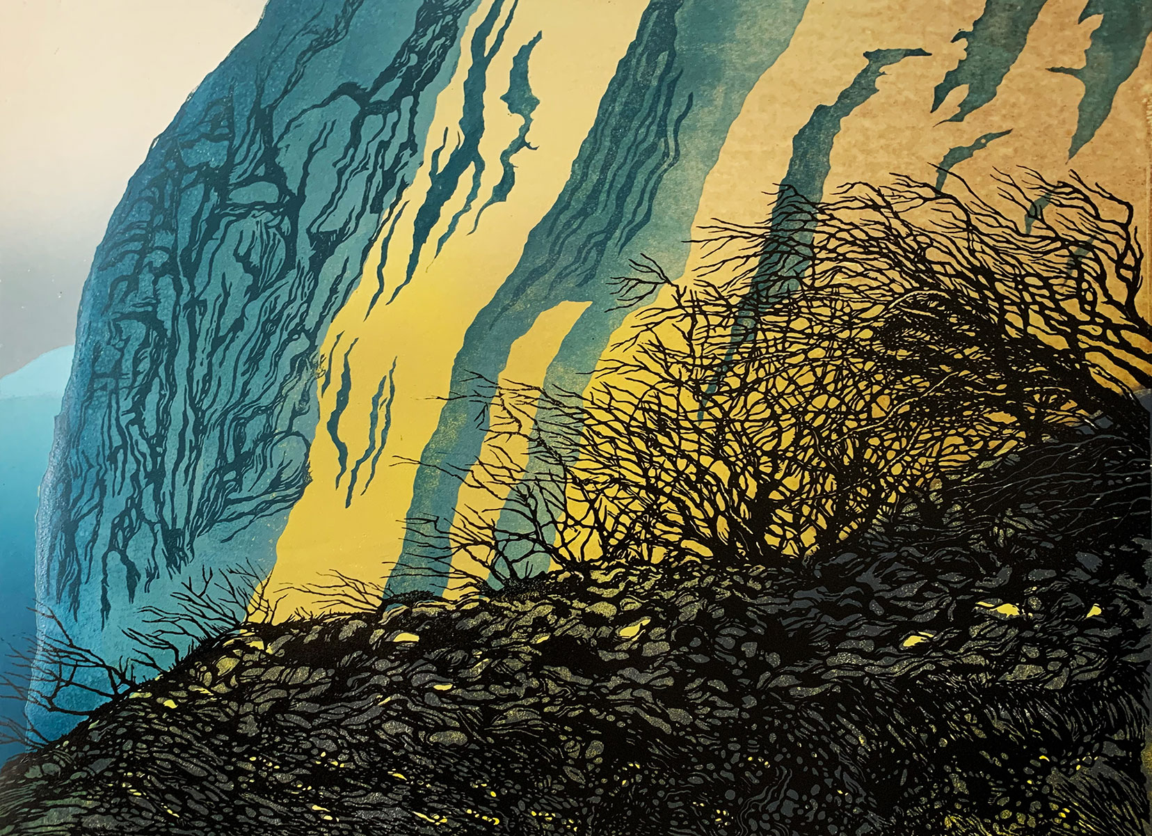
The finished print, after three weeks of cutting and inking. In the end, it's an edition of 9 - six were lost in action...
This print is currently for sale for £250 in the portfolio/shop section of my website - please click here
This print is currently for sale for £250 in the portfolio/shop section of my website - please click here
Connect


My newsletter: