Creating 'Hawthorns'
Publication date: 21 July 2020
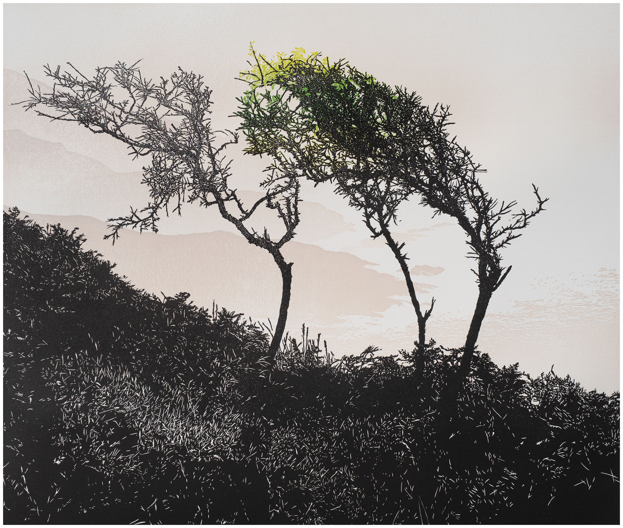
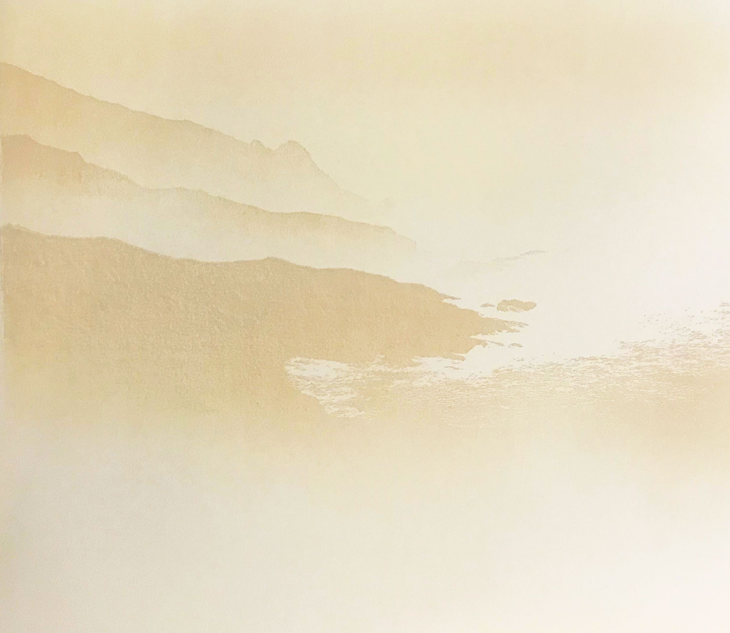
An overcast day on the cliff path walking East from Gara Rock towards Moorsand Beach. A trio of Hawthorns silouetted against the coastline.
This is the finished print: a limited edition of 9 - 52x43cm - you can buy it here (the first 2 prints are available for £250 plus postage until the end of July when they'll go to the normal price of £400)
And here's how it was made:
I deliberately over-exposed the source photo to make sure I didn't lose the detail of the coastline as it disappeared into the mist. This doesn't make for a great photo, but it does prepare the way for creating the print I have in mind.
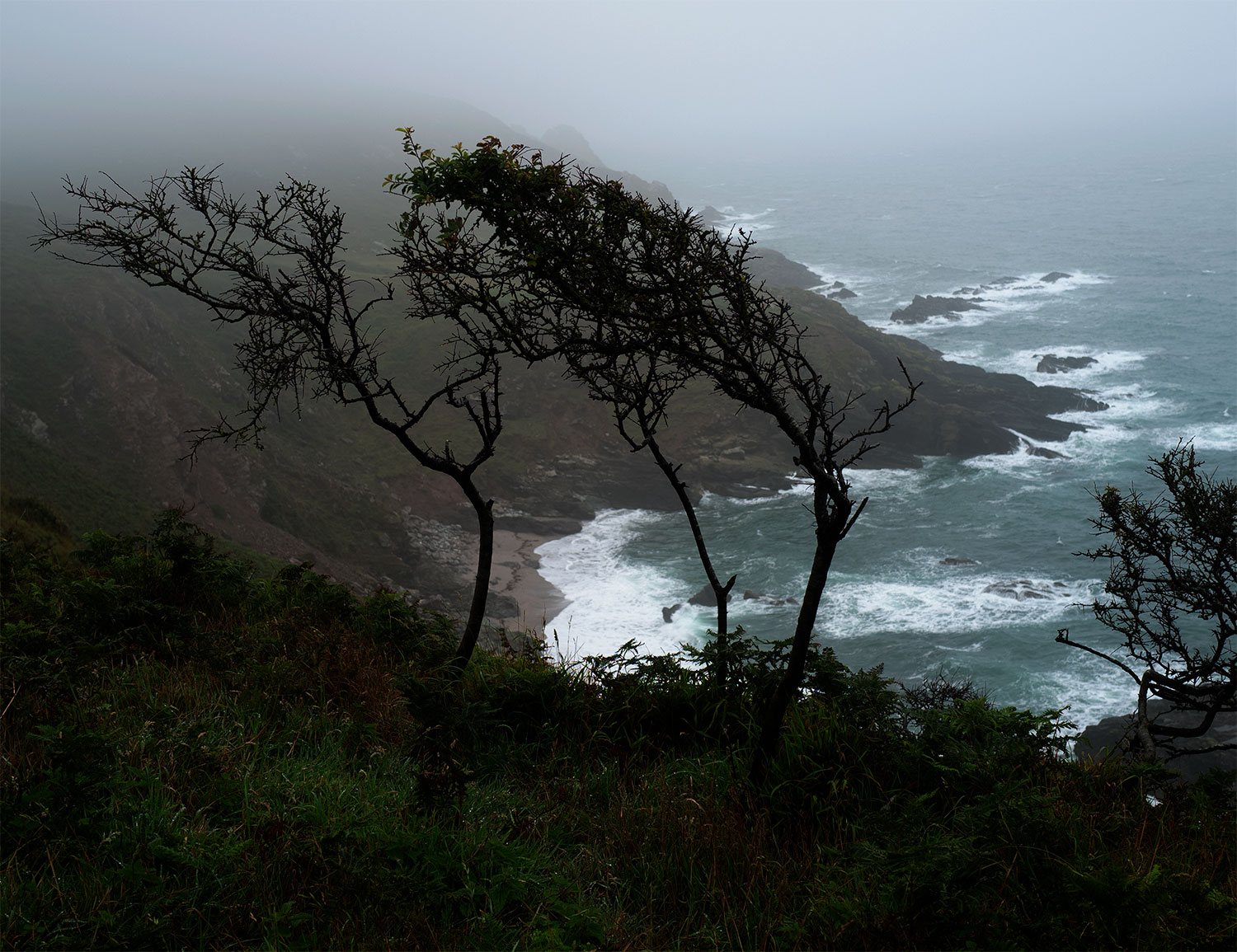
The photo contains all the elements I want to work with, but the composition doesn't work for me - the way the trees are 'framed' by the cliffs in the distance - the business on the right-hand side of the picture...
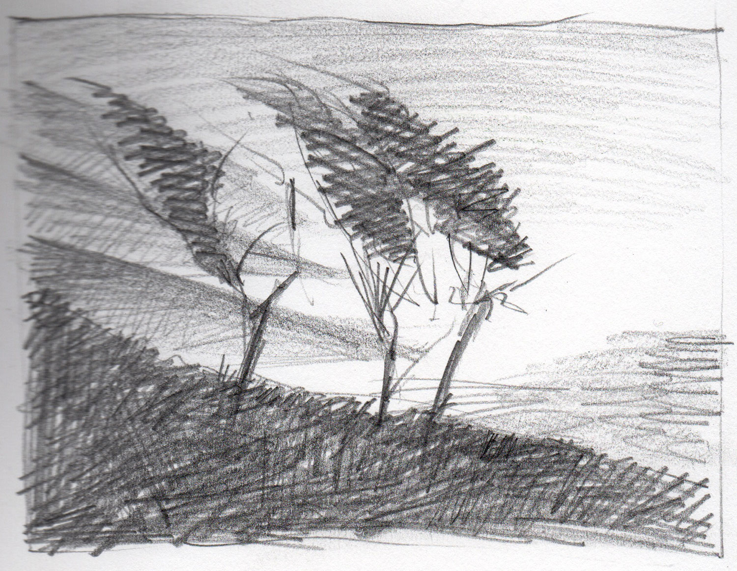
Here's a quick drawing I made while I was planning ways to address these issues:
Here's a quick drawing I made while I was planning ways to address these issues:
I decided, for once, that I was going to allow myself the luxury of using the 'reduction' technique in the making of this print. A reduction print is one where you usually print your lightest colour from the lino block - you then cut away part of the lino in order to overprint with a different colour from the remaining part of the lino. You can keep repeating this process until you have all the colours you want.
The reduction technique is great from the point of view of registration because you don't have to deal with the alignment of separate blocks. However, this is a destructive technique - once you cut away part of the block there's no going back - so when the edition is finished you can never produce additional prints - and if, while you're producing the edition, you mess up a print, the edition size is permanenty reduced. With each each reduction stage you run the risk of losing prints due to errors in the printing of the latest one. In the case of this print, I was going for 6 stages - plenty of potential for ending up with a very small edition!
The reduction technique is great from the point of view of registration because you don't have to deal with the alignment of separate blocks. However, this is a destructive technique - once you cut away part of the block there's no going back - so when the edition is finished you can never produce additional prints - and if, while you're producing the edition, you mess up a print, the edition size is permanenty reduced. With each each reduction stage you run the risk of losing prints due to errors in the printing of the latest one. In the case of this print, I was going for 6 stages - plenty of potential for ending up with a very small edition!
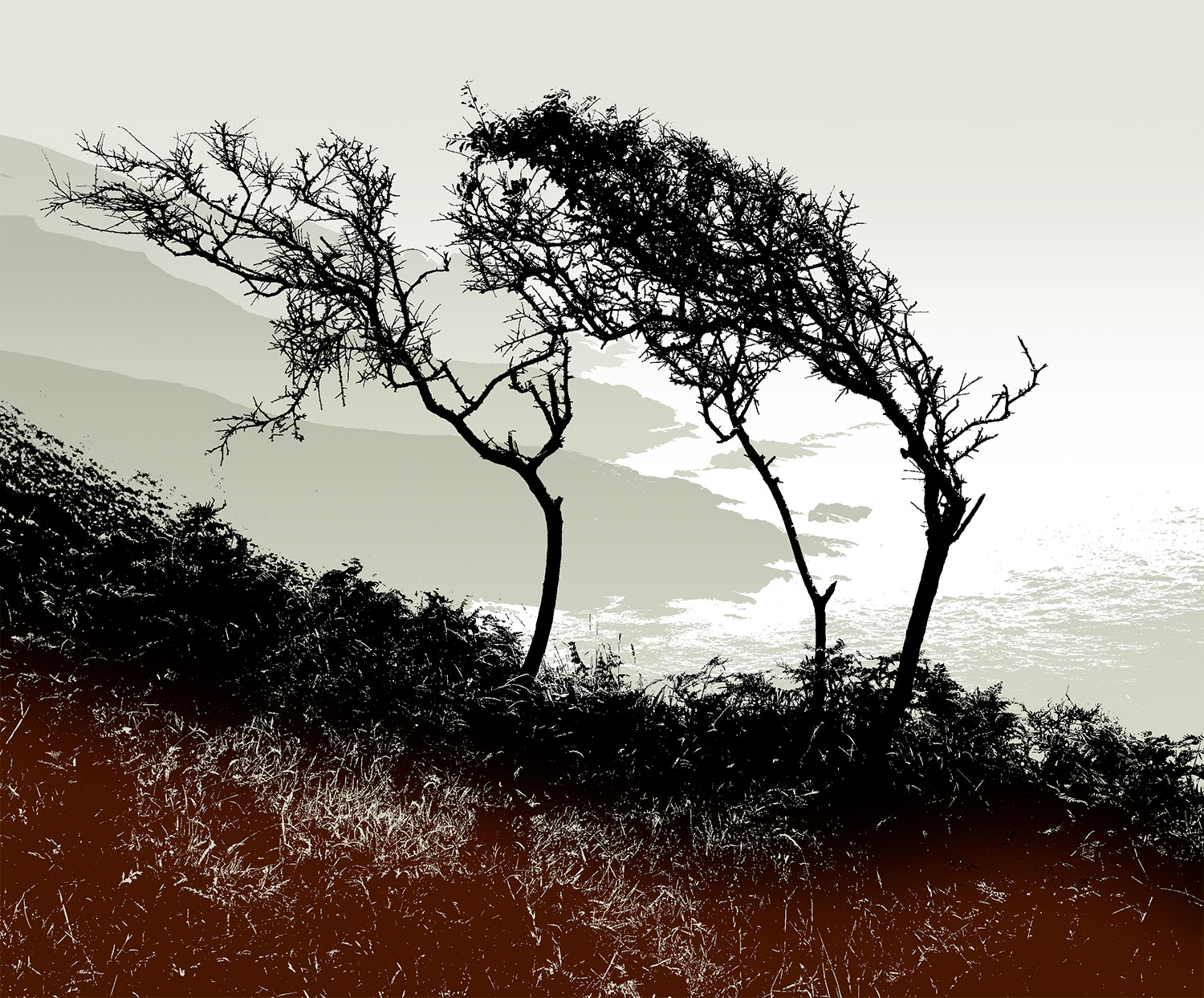
Above: the master plan as a Photoshop image
I plan my print using Photoshop. After working on various parts of the original photograph (turning photo greys to hard blacks etc) I end up with a multi-layered image from which I can produce the cutting 'templates' that will be placed on the lino. The tonal layers in the above picture can each be turned to solid black for transfer to the lino block.
I plan my print using Photoshop. After working on various parts of the original photograph (turning photo greys to hard blacks etc) I end up with a multi-layered image from which I can produce the cutting 'templates' that will be placed on the lino. The tonal layers in the above picture can each be turned to solid black for transfer to the lino block.
Above: planning the grades for the backgound
After printing a flat panel gradient for the misty sky, I cut all the coastline onto a single block that was then reduced in three stages - each stage a separate grade.
After printing a flat panel gradient for the misty sky, I cut all the coastline onto a single block that was then reduced in three stages - each stage a separate grade.
Above: the background printing finished
To reach point I printed 4 times (sky, plus the three headland elements). I started with 20 pieces of paper and managed to spoil only three of them (I fed one through the press the wrong way up, another had a little double-imaging on it, and the ink on the third had a spot of burnt umber that hadn't been properly mixed in... all avoidable errors... none caused by registration - thanks to the same block being used each time, and to the registration tabs, which ensured the paper was positioned correctly each time).
To reach point I printed 4 times (sky, plus the three headland elements). I started with 20 pieces of paper and managed to spoil only three of them (I fed one through the press the wrong way up, another had a little double-imaging on it, and the ink on the third had a spot of burnt umber that hadn't been properly mixed in... all avoidable errors... none caused by registration - thanks to the same block being used each time, and to the registration tabs, which ensured the paper was positioned correctly each time).
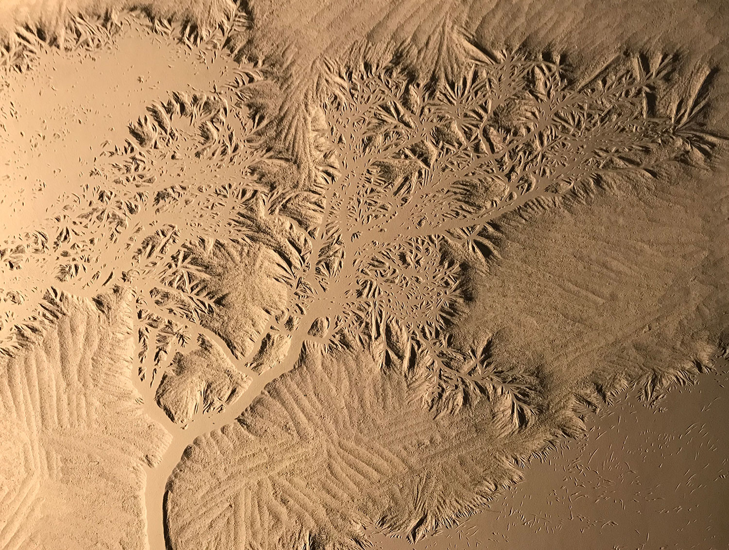
Above: part of the main block, cutting completed
I finished cutting the main block quite quickly - it took about 30 hours.
Rather than printing this foreground image in black alone, I decided to include the green of the leaves clinging to the uppermost branches of the main tree. Using the reduction method, I planned to print a small area of (green) colour. When that was done,I planned to cut away the parts of the block that contained the leaves, after which, I would print black using the reduced block. After that, the block would be effectively destroyed.
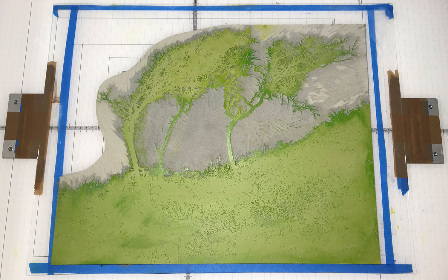
Above: the main block on the press for proofing
This is the block prior to cutting away the leaves. It's green because I used that colour to produce a proof to check the overall quality of the cutting - if I had used black, then the block would have been stained with that colour, which would probably mess up the printing of the leaf green.
This is the block prior to cutting away the leaves. It's green because I used that colour to produce a proof to check the overall quality of the cutting - if I had used black, then the block would have been stained with that colour, which would probably mess up the printing of the leaf green.
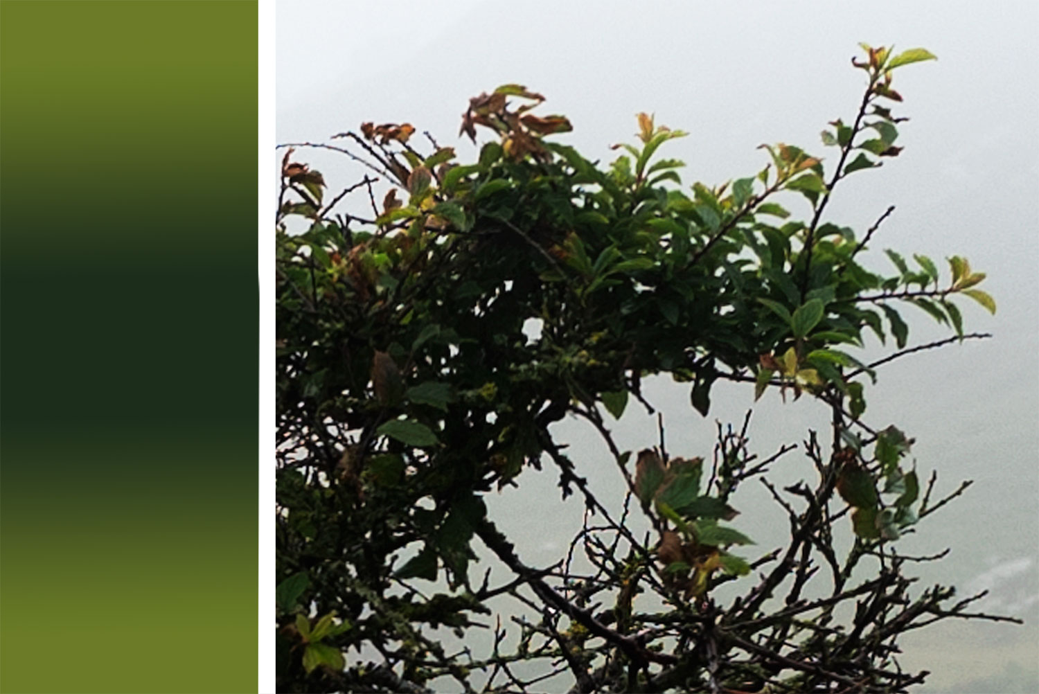
Above: planning the 'double' grade for the leaves
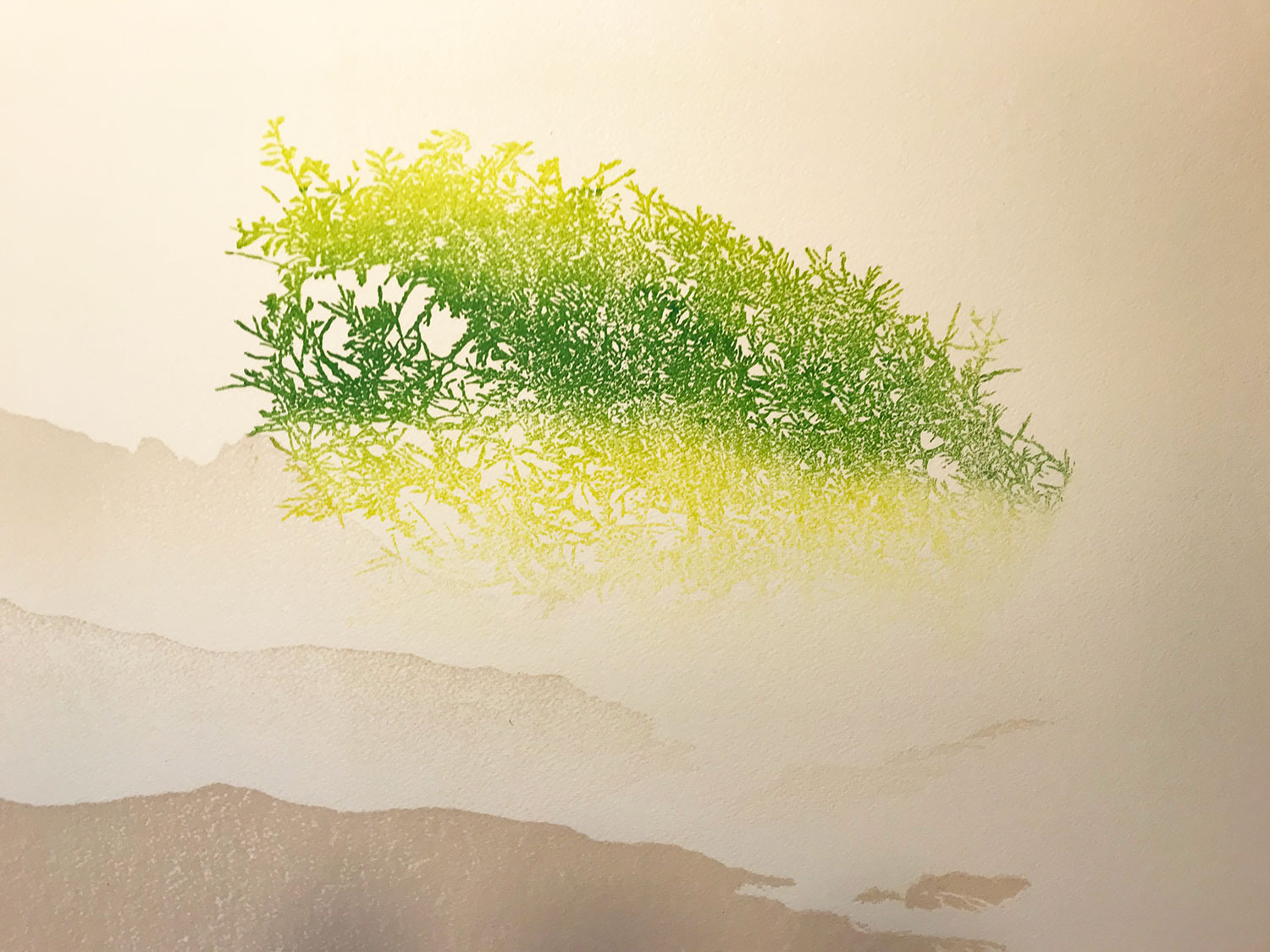
Above: the green after printing (detail) - lighter than planned because I realised, during the preparation of the ink, that I need more colour contrast in the grade
This is the penultimate stage in the printing - the colour that will appear in those places where I cut away the leaves from the main block - you have to imagine this with the black detail printed over the top!
This is the penultimate stage in the printing - the colour that will appear in those places where I cut away the leaves from the main block - you have to imagine this with the black detail printed over the top!
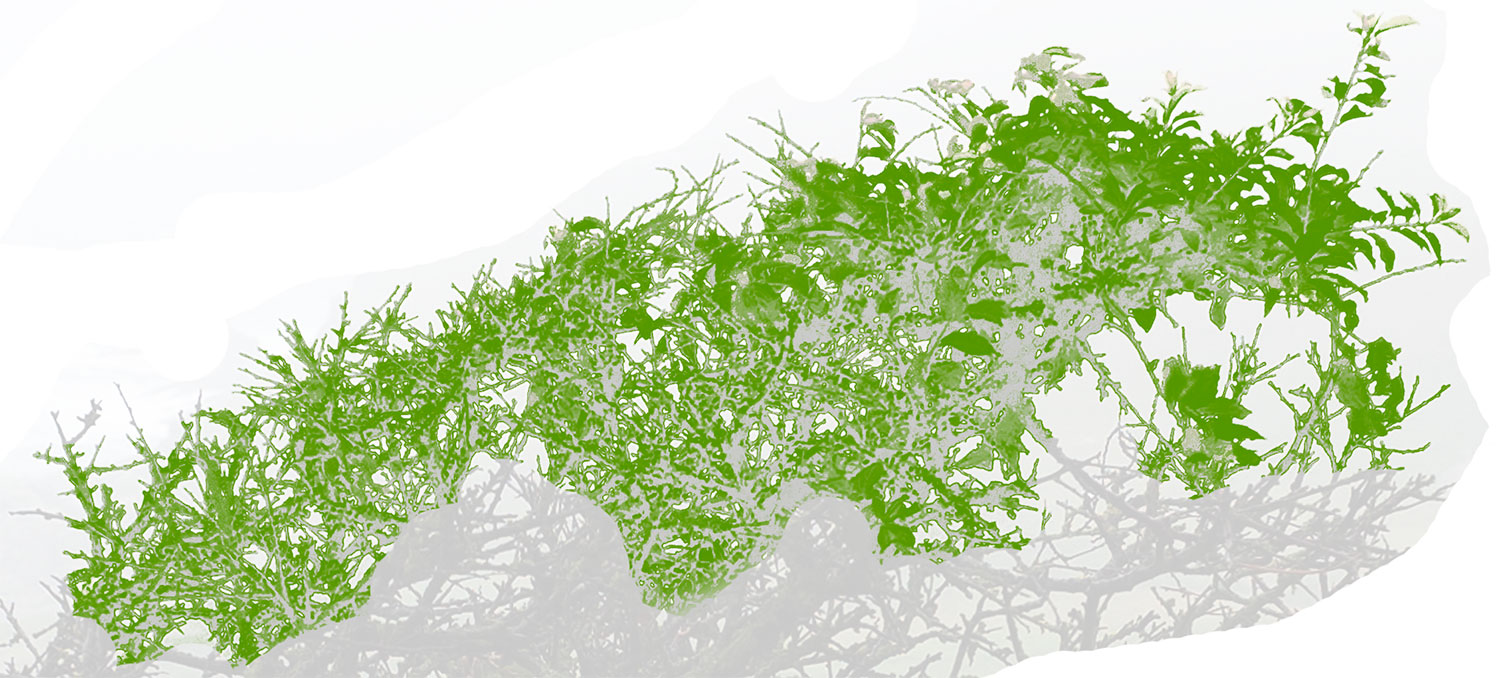
Above: planning the cutting of the leaves
I produced this image to help me locate the leaves on the final block so I could cut them away. With reference to this image, I drew the leaf shapes onto the block, then I cut them away.
I produced this image to help me locate the leaves on the final block so I could cut them away. With reference to this image, I drew the leaf shapes onto the block, then I cut them away.
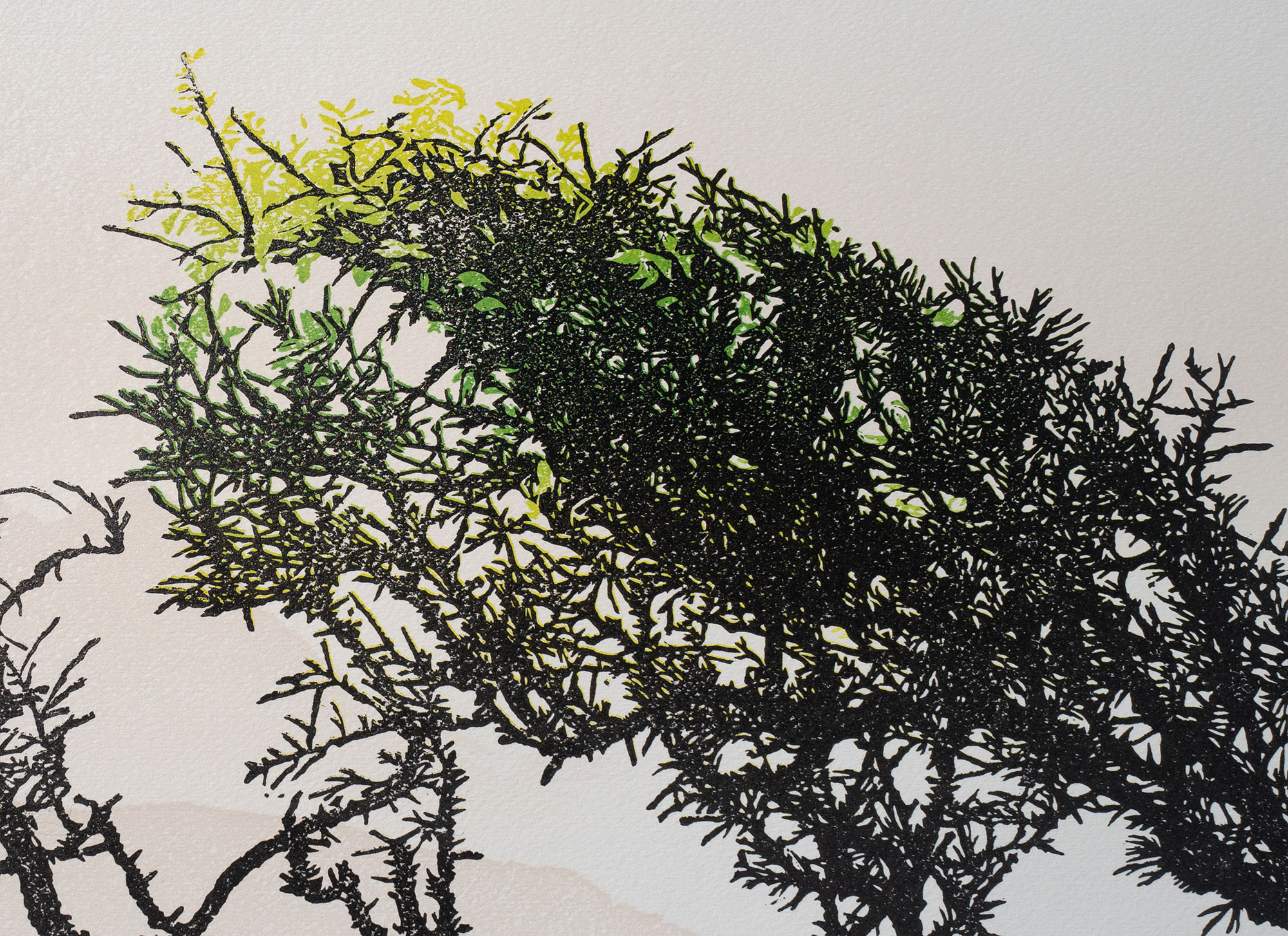
Above: detail from the finished print
Above: the finished print (to save you scrolling back to the top!)
By the end of the process I had 9 prints I was happy with, plus three 'seconds' where the black was a little too light in places.
What I leanered from producing this print:
1) Despite it being a destructive proces, employing the reduction technique made registration a lot easier - I have to let go of the idea that I need to retain the facility to print more copies in future, and I have to trust that I have the technical ability to produce a reasonable number of prints for the edition
2) The layered effect in the background works nicely and was fairly easy to do - it could have been a little darker - I was too concerned about it interfering with the foreground imagery
3) I'm happy with this result, but I think it's time I became less 'dependent' on large areas of black
If you would like to buy a copy of this print, please click here
Connect


My newsletter: