Creating 'From Redgate Beach'
Publication date: 5 June 2020
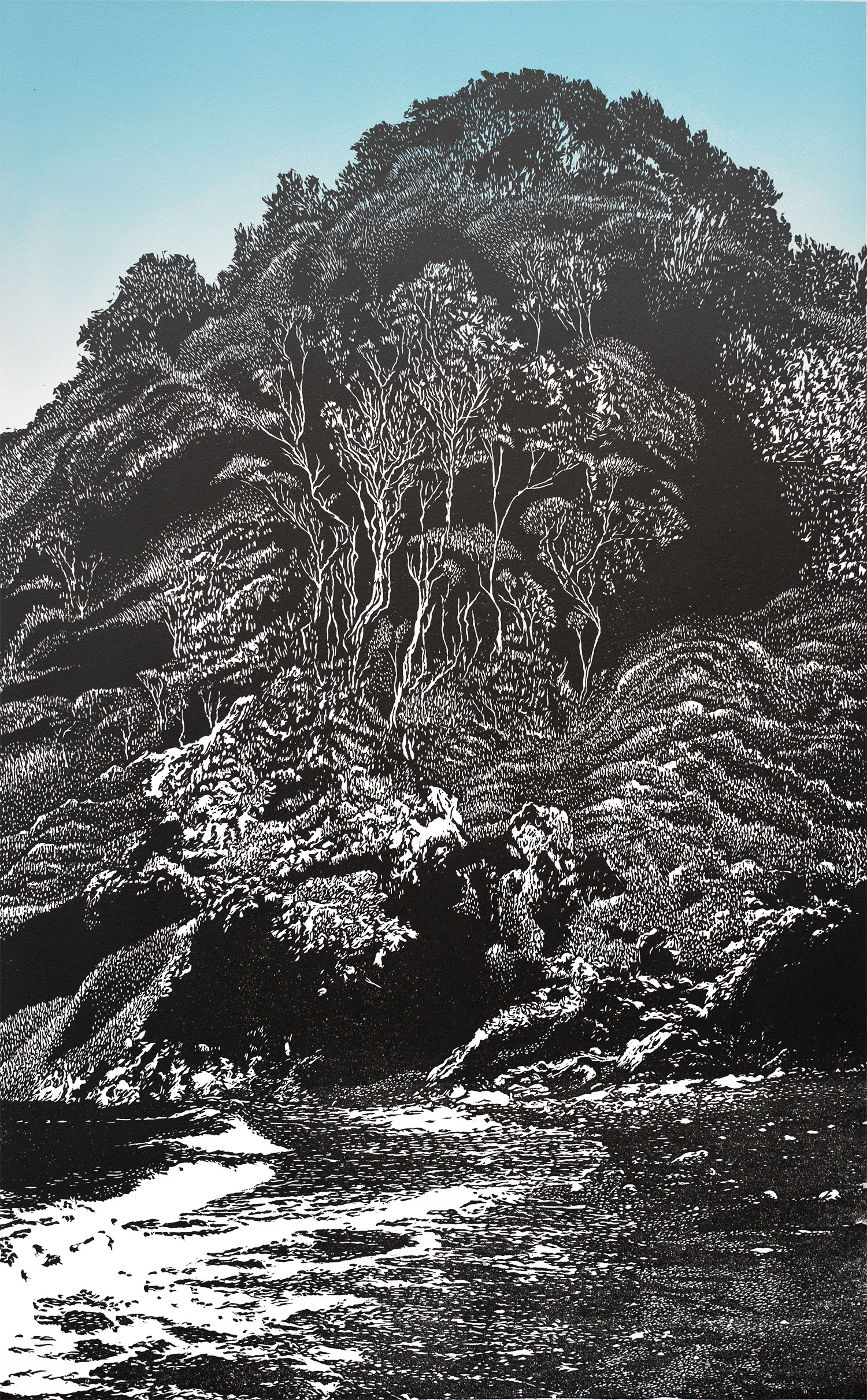
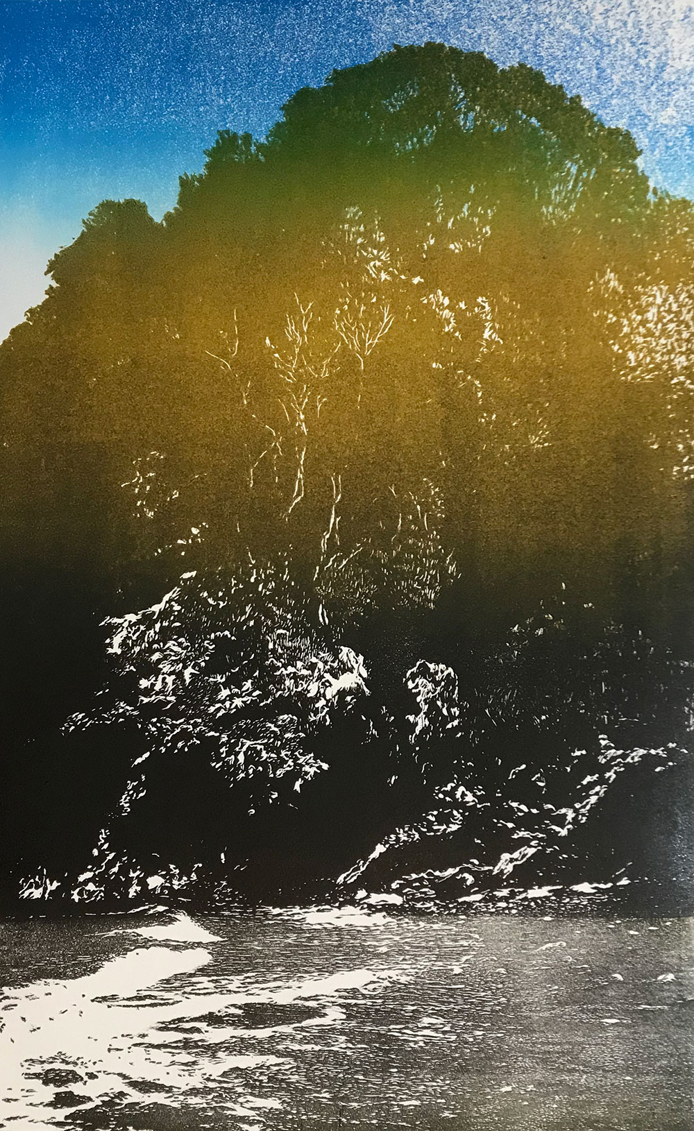
Here is the finished print, which is available to buy in my Collections shop (click here).
This is a limited edition of 20 relief lino prints. Dimensions (image area): 32.5 x 52cm.
Keep scrolling to find out how I produced this print...

Here is the finished print, which is available to buy in my Collections shop (click here).
This is a limited edition of 20 relief lino prints. Dimensions (image area): 32.5 x 52cm.
Keep scrolling to find out how I produced this print...
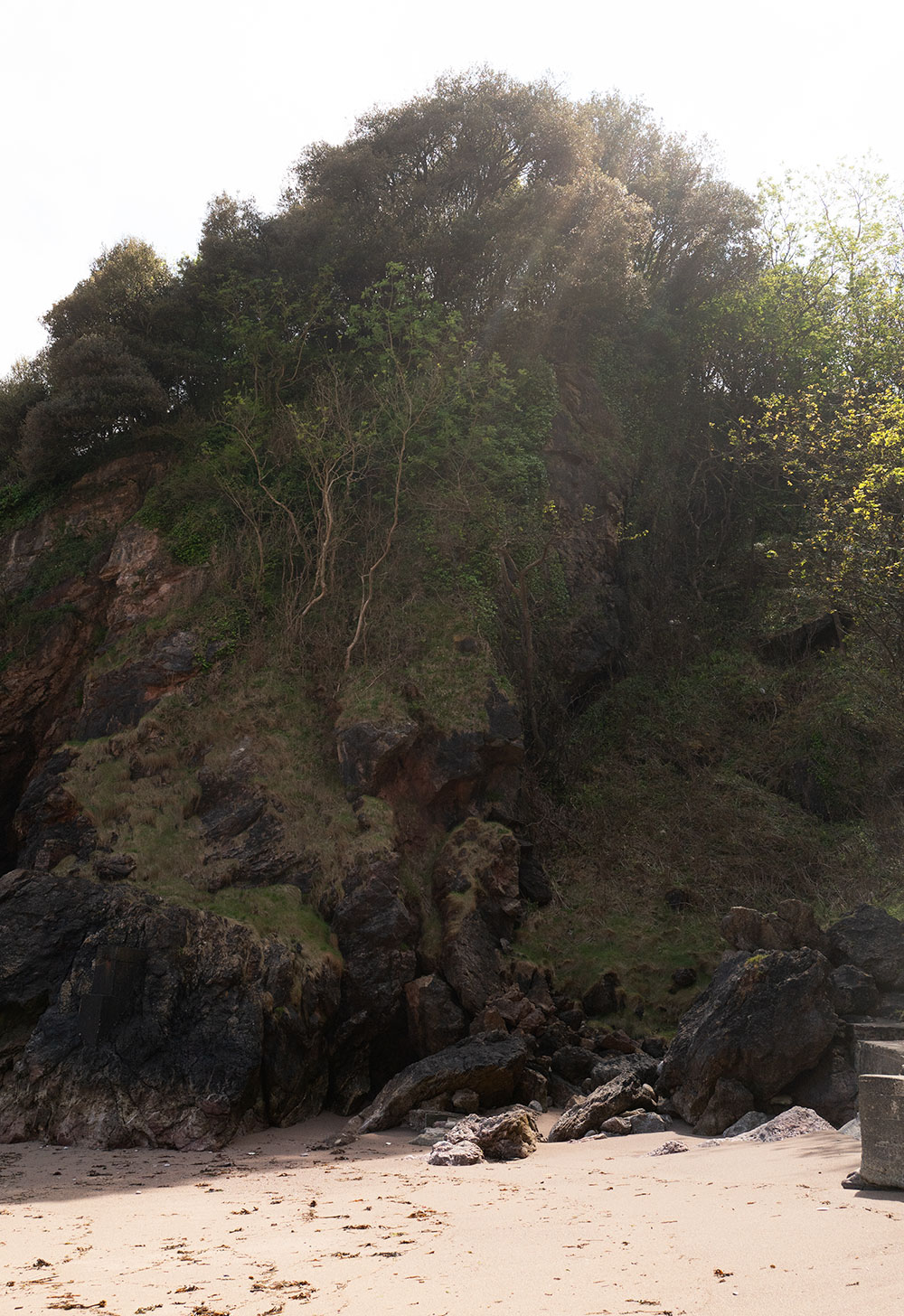
This is a view based on a photograph I took in May 2020 from Redgate Beach, near my home in Torquay.
Redgate Beach is closed to the public. The original access to the beach has all but disappeared, making it necessary to make a slightly precarious descent from the cliffs that loom above the sands - cliffs that are subject to landslide - and once on the beach there's no easy way off it at high tide.
Which is not to say no-one ever goes there - but the few that doare mostly rock climbers and the couple of guys who have made their home in a tent at the foot of the cliffs.
I took my photo facing south. The pair of trees in the centre of the frame, and the grass-covered rocks, made me think of Japanese prints by artists like Hokusai.
As you can see, there is no sea in the photo - the tide was out. So I introduced the water and a revised beach from photo I'd taken of a different beach on different day.
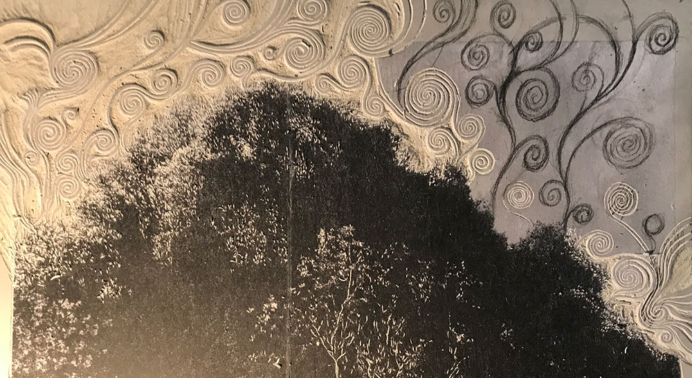
As I was getting into the cutting I was thinking about the invisible energy rising out the wood, which led me to attempt to capture that idea with celtic-style lines and circles. I spent quite a few hours completing this element, but as soon as I saw the proof I realised the patterns were too clunky - there are limits to how fine I can make this kind of imagery - so they were cut away and abandoned...
The next proof was a full-colour print. I printed the blue background, then I worked with a grade of burnt umber to black. After a couple of these, I realised the sea and sand needed to less-black - so this element is deliberately under-inked.
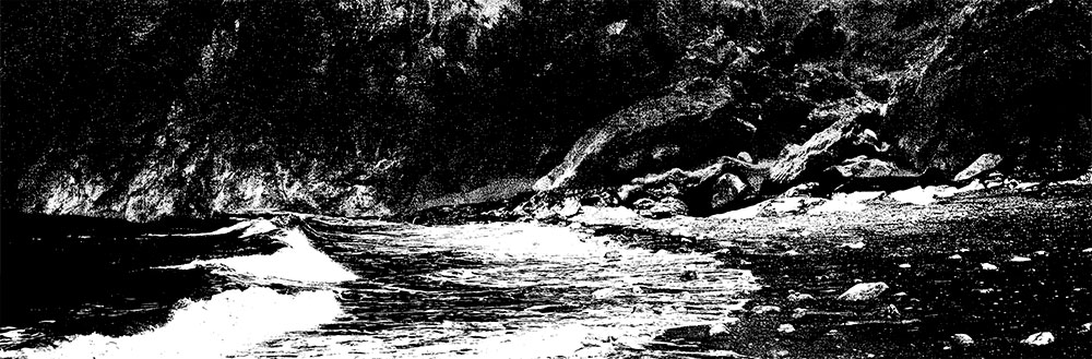
But the result was distinctly unsatisfying - I had tried to retain the fine lines from the photograph - but they were too fine for the medium. There is more detail in the cutting than apears in the print (above) but the lines were filling with ink.
At this stage I was pretty-much decided on scrapping the project.
But instead of immediately throwing away over a week's work, I decided to experiment with the block by making the lines stronger (at risk of making them too heavy) and by adding a lot more 'invented' texture. I deliberately put the original image to one side and went for 'free cutting' - taking proofs every few hours to check the build of of tone and pattern.
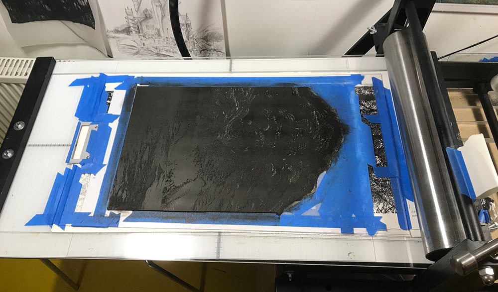
The image above is of the block on the press at the end of printing.
The image above is of the block on the press at the end of printing.
And here are a few of the prints, drying in the sun.
This print may be quite a critical one in the development of my image-making. For a while now, I've wanted to combine more free drawing with the photographic interpretation that has been a kind of theme of my work. While this print may be a little too lyrical for what I have in mind, it works as a proof of concept - that the two textures - the freehand and the semi-photographic - can work alongside each other in a single print.
Here's the finished print again, to save you having to scroll back up the page!
Connect


My newsletter: